Vibrant and full of motion, the Expo 2027 Belgrade logo brings to life the specialized exhibition’s theme “Play for Humanity: Sport and Music for All” and mirrors the city’s dynamic geography. Designer Saša Vidaković shares the inspiration behind this distinctive visual identity.
Table of Contents
Expo 2027 Logo Explained
Fluid Design Reflects the Event’s Theme
“Play for Humanity: Sport and Music for All” is the theme of the world fair that will take place in Belgrade from May 15 to August 15, 2027. The event’s logo brings this idea to life through a flowing form that evokes motion, creativity, and connection.
Its designer, Saša Vidaković, a Serbian creative based in London and founder of SVIDesign, explained that a colorful, continuous form is expressive of “the cat’s cradle game that children play, making endless permutations with elastic bands across their fingers.”
A Creative Representation of Belgrade’s Two Rivers
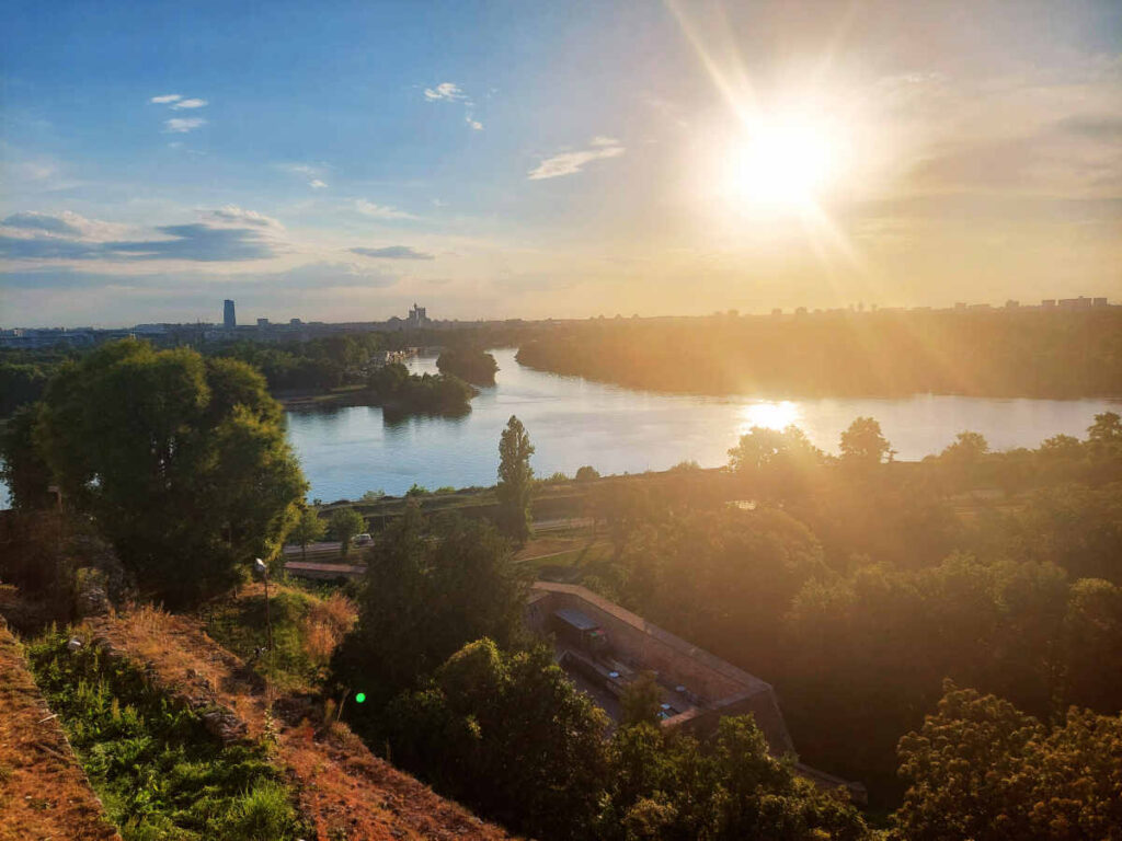
The logo also draws inspiration from Belgrade’s unique geographical position at the meeting point of two mighty rivers. The city lies at the confluence of the Sava and the Danube, offering a breathtaking view that captivates both locals and visitors from Kalemegdan Park, near the Victor Monument.
The logo’s fluidity reflects how the rivers shape Belgrade’s landscape, rhythm, and spirit. The intertwining colors and curves in the design represent these two waterways.
A Global Symbol of Belgrade and Serbia
The logo’s simplicity makes it instantly recognizable, while its layered meaning gives it depth. It speaks of movement, diversity, and cooperation — the same values that the specialized exhibition aims to highlight.
With Expo 2027 expected to attract more than four million visitors between May 15 and August 15, 2027, this vibrant emblem will soon become a global ambassador for Belgrade. It symbolizes an international event, as well as a confident, creative Serbia stepping onto the world stage.
Leave a Reply